As you may have noticed, I've been tooling around with the look of the blog.
This is still something of a work in progress, so don't be surprised if it's changed up a bit soon.
I'd also like to hear what you think of the new look!
I really dig yellow, and it's awfully appropriate (canaries and all), but am trying to decide on juuuust the right shade of it.
There's also the new logo I've designed.
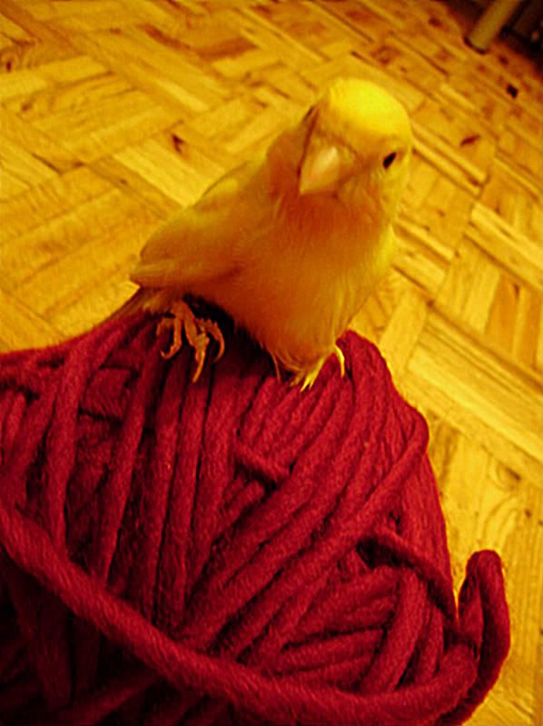
I was inspired by this adorable photo of my great little guy Butters, lo those many years ago.

Finally, I've set up a shiny, new email address (mostly because gmail is just so functional!)
You can now reach me at gmail here: canaryknitsdesigns.

2 comments:
I really like the new look! Nice work on the logo Teresa!
The logo is perfect.
Post a Comment